
Having a home dashboard was one of my recent objectives, and beyond the fun aspect of coding, I aimed for something a bit futuristic—akin to what we often see in movies or TV shows.
Let’s see what we got for this first version!
It might be obvious to some, but the screenshots and videos featured in this article display real data. This is not a demo or a mock-up.
Genesis
Every morning involves the same ritual: checking the weather forecast, the temperature and air quality inside the apartment, scheduling the vacuum and mop cleaner, checking the next bus or tramway to work, the day’s agenda, etc.
For each of these tasks, we use connected devices or apps, each operated by a different company, entailing several authentication processes and different user interfaces.
This dashboard aims to amalgamate all these data points onto a single screen.
Another goal was to develop the type of interfaces seen in TV shows or movies. I’m a huge fan of Sci-Fi and Cyberpunk genres—Altered Carbon, Cyberpunk 2077, Foundation, Stargate, The Expanse, to name a few.
These shows often feature sleek, futuristic user interfaces. While we’re nearing 2022 and are far from achieving what’s depicted in fiction, technically, we’re capable. Yet, often, business interests prioritize functionality over aesthetics, leading to outdated and clunky interfaces even in advanced sectors like aerospace. The primary goal is operational reliability, not flashy interfaces, though companies like SpaceX are beginning to move the needle.
Why Lady of Shalott?
The idea for this dashboard struck me during the strict lockdown caused by the pandemic. It reminded me of The Lady of Shalott, a tale of a woman cursed to live in a tower, observing the outside world only through her mirror.
Since the first version of this dashboard was aimed to be embedded in a mirror, it made a lot of sense given the context!
The first version
Let’s take a look at the results now, before diving into the technical details.
Here’s what the first version looks like, featuring an alarm triggered by air quality:
And another video of the dashboard in action, placed at the entrance of our apartment:
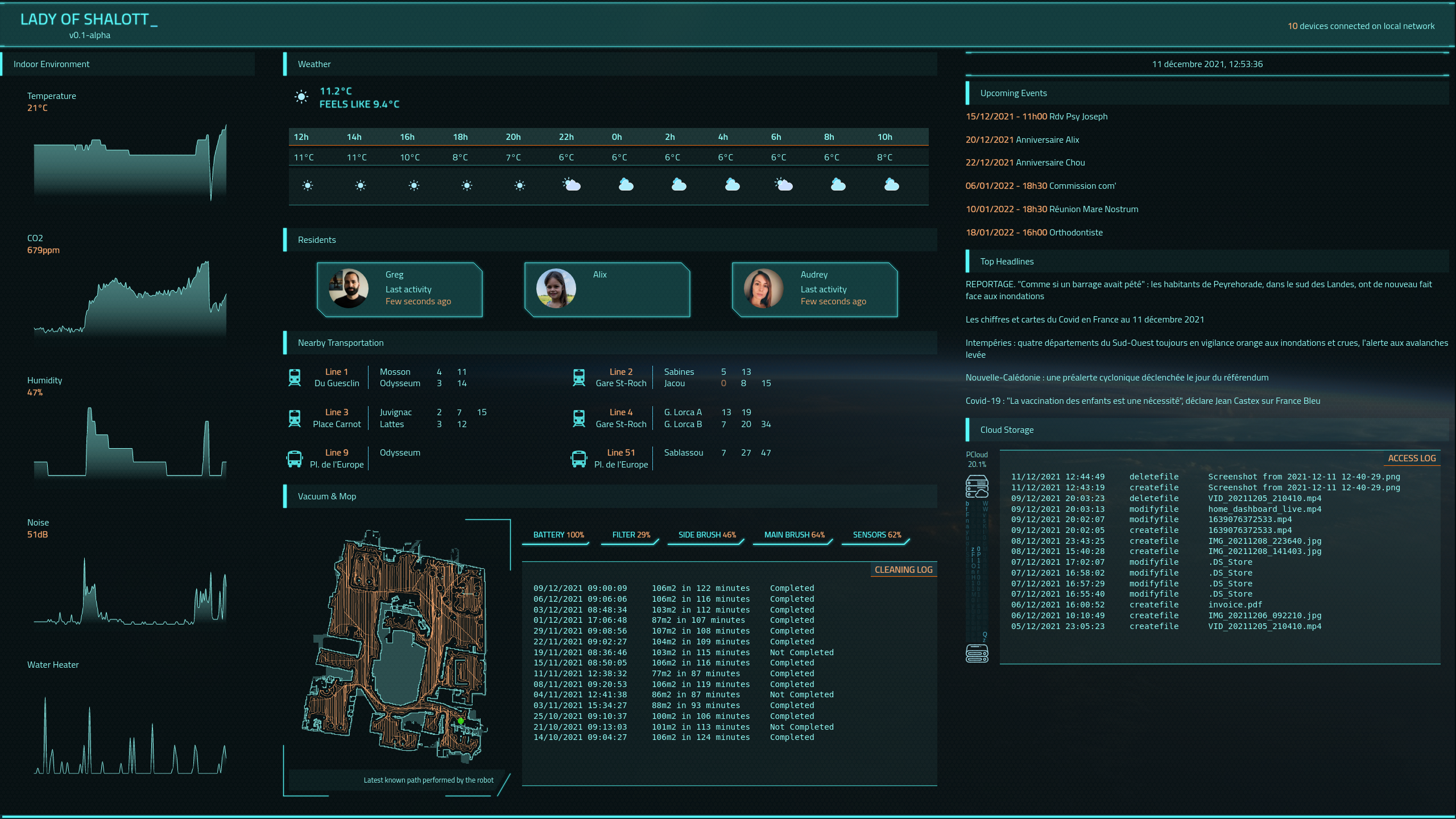
A screenshot offering a better resolution than the previous videos (click to zoom):
Let’s talk about the tech behind
The technology stack for this project is relatively standard for modern web development.
It’s a simple web application: a JavaScript client in a browser requests data from an HTTP server, which collects and sanitizes the data.
All components run locally within the apartment and are inaccessible from outside.
Client
I’m not particularly fond of modern web technologies like React or Vue, finding them overly complex. This complexity stems from attempts to advance UI technology using outdated foundations.
However, these technologies are still valuable for building sophisticated applications, which ultimately is what matters.
BThe frontend was developed using simple React, without additional frameworks like Redux. It’s written in JavaScript, opting not to use TypeScript, mainly to maintain a straightforward toolchain.
I relied on Arwes and ApexCharts to achieve a visually appealing design.
Though the first version largely met my expectations, the performance sometimes suffers due to the number of animations and data updates. I’m exploring WebGPU for a smoother experience, but the technology and supporting libraries are still maturing.
Server
The server is doing two kinds of tasks:
- On-demand data retrieval, such as news or weather forecasts, requested periodically by the client.
- Regular data collection for immediate availability upon client request, like indoor environment data from the vacuum robot, fetched every few minutes.
The server, written in Go, primarily uses the standard library for its HTTP server functionalities. For asynchronous tasks, I used go-cron.
I needed a network discovery tool to develop the presence feature, for that, I’ve used Go nmap bindings.
Some data, like public transportation schedules, weren’t available via API and required web scraping with colly.
One of the most tricky parts was the communication with the vacuum robot. I didn’t want to implement all the communication protocols by myself. Still, I didn’t find any suitable library in Go to do it (miio protocol implementation with the support of Roborock S7). After finding a suitable library in Python, I’ve developed a small module responsible for collecting the vacuum data and drawing the map with the last known path. I’m not used to this ecosystem, but there is such an amount of support and documentation everywhere on the web that it was not that difficult in the end. This python component is used by the server directly.
Where does the data come from?
Most of the data is sourced from dedicated APIs:
- Netatmo API for indoor sensors
- PCloud API for cloud drive
- Google Calendar API for agenda, with a dedicated Go SDK
- News API for top headlines
- Open Weather API for weather forecast
The most complex data to retrieve were related to the vacuum robot (Roborock S7), especially the map, and the public transportation data. For the latter, I tried to reverse-engineer the API used by the mobile app, but when I saw its complexity, to retrieve the next passages of the tramway, I preferred to fall back on the good old web scrapping method for their website.
What’s next?
With the foundation set, adding new components to the dashboard is straightforward, assuming the data is accessible.
I’m exploring additional personal data components (banking, investments, health, etc.), which require privacy considerations and cannot be displayed openly in our apartment entrance. To address this, I’m working on a gesture-based control system to switch views, leveraging camera input for hand-swipe detection. Initial tests are promising!
More generally, I want to make this dashboard evolve to a home assistant, talking to us and answering our requests. I’ll dig the existing open-source assistants for that; perhaps something cool is possible!
Finally, I’m seeking a more dynamic and visually engaging design for future versions, moving beyond the web-based, boxy layout of the first iteration.
That’s all for today, folks! There’s much more to discuss, likely in a future article about the second version of the dashboard.